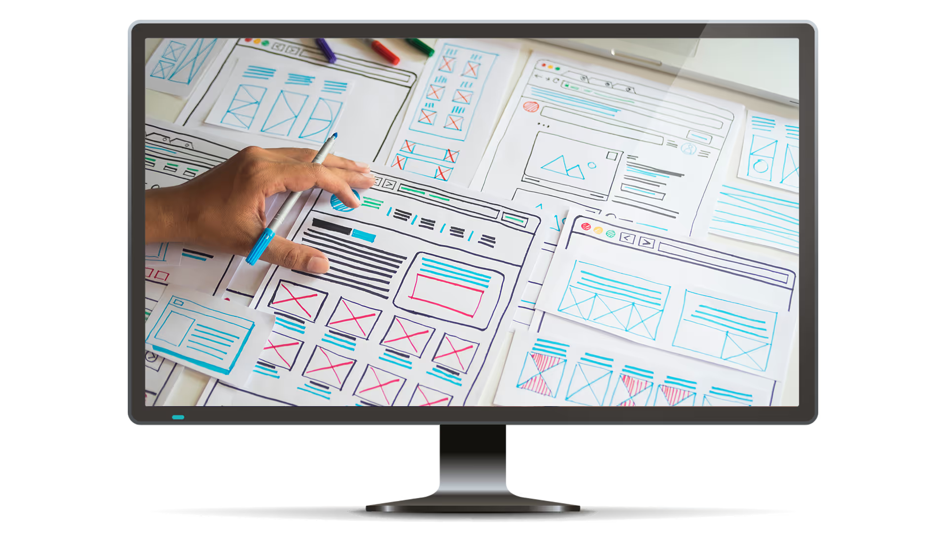
What Makes a Bad UX?


%20(1).webp)

So much of creating and maintaining a successful website has to do with getting users to your page and keeping them there. You can find countless articles and posts about what to do to draw users in, but what are the aspects of a site that can have an adverse effect on users?
We'll break down just a few of the things that can drive users away from an otherwise awesome website.
Poor navigation
Though users might be coming to your website from a different avenue (search results or a social link), they could keep clicking around if you've got good menu navigation. If your website doesn't have a clear path to the information your user is looking for, they could click straight off the page. This will contribute to your site's bounce rate.
Avoid this catastrophe by having clearly labelled menu options and clickable, relevant links within your posts. Don't make your users have to work to find their next destination on your website. You can even anticipate where the user might want to go next by adding a widget with your highest viewed content off to one side, or at the end of a post.
Lack of or inconsistent aesthetic
Even though the Y2K aesthetic is coming back in a big way among Gen Zers, an outdated web interface hasn't been en vogue since the dawn of Internet Explorer. Though you may like the look of a cluttered, content heavy homepage, users could get confused if there's not clear branding.
Select a colour palette and stick to it. You don't need a logo to build a brand, you can just pick your favourite few fonts and utilise them throughout your website. Less is more here: don't try to crowd in too many different elements, but be sure you have created an identifiable product that will keep your users coming back for your excellent content.
Disconnect between mobile and desktop
Mobile users have been outpacing desktop users since 2019 and don't show any signs of slowing. This means your mobile site needs to be just as clear-cut and charming as your desktop version.
This doesn't mean you can skimp on desktop design either. You don't need to add flashy features or build an award-winning app, just ensure that your users have a seamless experience no matter what device they're browsing on.
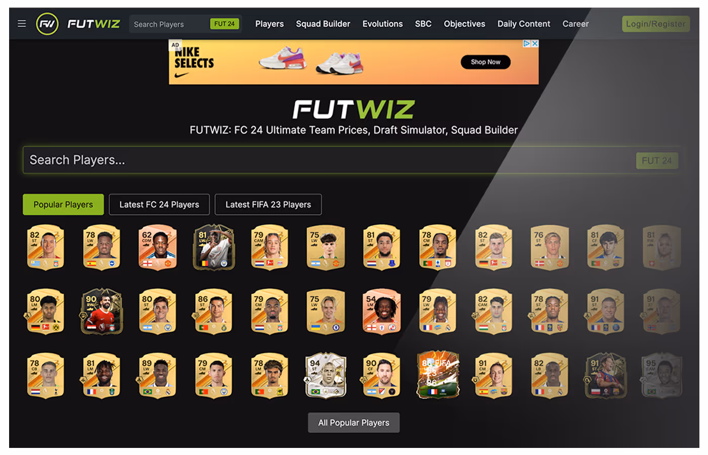
Too many ads
How often have you gone to one of your favourite websites, only to suddenly find their page peppered with annoying, irrelevant ads? It's enough to send you straight back to your search results.
Here at Publisher Collective, we can help you to decide which ad formats and placements are going to have the least impact on your user's experience. We believe your content is king, and it should reign supreme over any additional advertising you'd like to add to your website. By keeping this mindset, you can avoid pop-up fatigue and ad exhaustion that drive users away from websites.
We've got a plethora of excellent advice to help you make your site the best it can be, whether you're just starting out or you're a seasoned pro. Check out our other blog posts here. Are you interested in becoming a Publisher Collective partner? You can apply here.
Book a call with an expert
We pride ourselves on creating meaningful relationships with our publishers, understanding their priorities and customizing our solutions to meet their unique needs.